These are of course my opinions, but ones that I think have some validity, as I've been involved with s9y as a user and plugin author since around version .05-06.
First off, I agree heartily that branding is important. The efforts you've made are fantastic. The new wiki/portal/logo looks great, but I'll return to that in a minute.
Branding:
I think you're quite right that branding has been an issue. The biggest and long acknowledged problem is that the name of the product has never fully connected with the branding, nor has an attempt been made to connect it.
Let's look at the definition of the word:
ser·en·dip·i·ty Audio pronunciation of "serendipity" ( P ) Pronunciation Key (srn-dp-t)
n. pl. ser·en·dip·i·ties
1. The faculty of making fortunate discoveries by accident.
2. The fact or occurrence of such discoveries.
3. An instance of making such a discovery.
Not the greatest basis for the actual product, since the design and development of serendipity has been from what I can see quite the opposite. However, we also have this note:
We are indebted to the English author Horace Walpole for the word serendipity, which he coined in one of the 3,000 or more letters on which his literary reputation primarily rests. In a letter of January 28, 1754, Walpole says that “this discovery, indeed, is almost of that kind which I call Serendipity, a very expressive word.” Walpole formed the word on an old name for Sri Lanka, Serendip. He explained that this name was part of the title of “a silly fairy tale, called The Three Princes of Serendip: as their highnesses traveled, they were always making discoveries, by accidents and sagacity, of things which they were not in quest of....”
Perhaps if the product was called "Serendip" there might be a successful deconstruction (Serene-Dip?) or perhaps a new more fitting name is in order? These questions should be pondered before the consideration of whether a fancy new logo actually helps with the original problem.
One thing I do know about branding, is that a good logo scales up and down, and many people (myself included) are concerned that the current atom is far too busy to achieve that scalability.
I also don't know how the phrase "Tell the world" crept in there, but in a world where words are cheap, I tend to think that idea ought to be put up for community review as well.
One of the biggest problems that serendipity has always had is the paucity of documentation, the relatively few and somewhat bland templates, and the difficulty of letting users know which of the many plugins do what, and how and when to use them to accomplish what goals. No doubt that this is because so many of us are programmers, we don't mind messing around with plugins, and looking at source code.
Lately the themes issue has been improved a great deal thanks to the efforts of the theme contributors. We finally have
http://themes.s9y.org! A great and necessary step that will continue to help boost visibility, and sell serendipity to the people that are looking at the window dressing.
However, from what I can see, the main reason that serendipity has thrived is the developer focus. The core group and the plugin developers have brought s9y.org a long way, and when I argue to people that it's a great blog, my arguments are almost always technical, and often involve pointing out the people from the php community who have been involved with the project, and the people who use it.
What else could be/should be done? A plugin developer portal at
http://plugins.s9y.org to match
http://themes.s9y.org/ would really help sell it, if my experience with mambo and joomla are any indication. I don't see Serendipity being able to compete with Wordpress or MT etc. without promoting it on its merits, which have always been features & architecture. Those that could care less will now have the pretty pictures and gallery of themes to choose from.
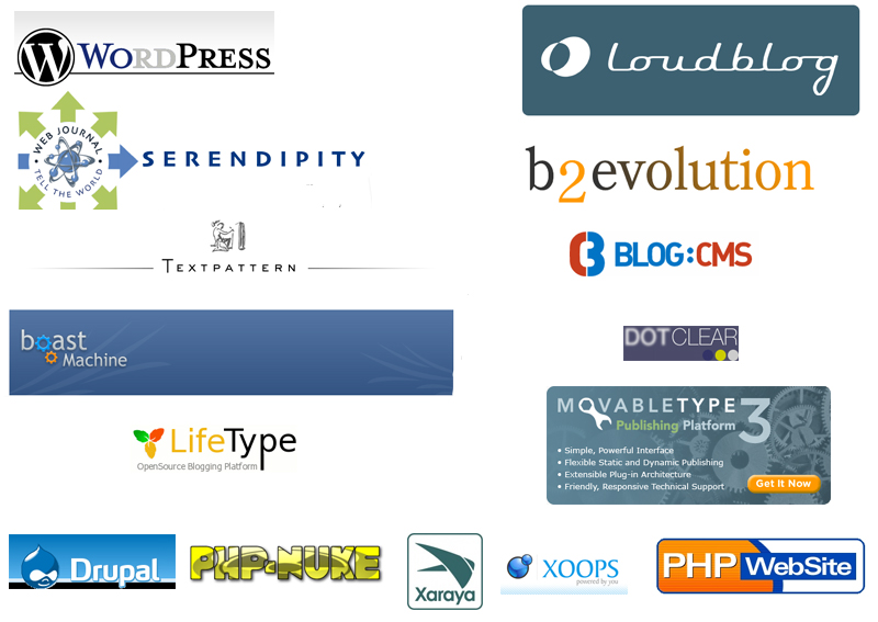
I said I'd return to the logo, so here goes. I agree with many of the other respondents that the atom logo is just too big. For comparison, I've included a bunch of competition logos/mastheads, and threw in a few cms logos for fun. People should definately keep the mambo and joomla logos in mind although I've left them off, as they were already linked to previously (or at least Joomla was).
While I appreciate that a consensus of the "core devs" was obtained, I'm left wondering what the purpose of soliciting input from the community is when the message you're receiving is that the new logo, while a vast improvement over the coffee cup, could still use some work?